Adding a Log-in Page
This page describes adding a log-in page to your website, and includes descriptions of the following Element Types:
- Login Control (Element includes fields and a button to allow logging in)
- Show Login State (Element displays the current log-in status i.e. logged in or logged out)
- Logged in Customer/Person Name (Element displays the name of the Contact or Person who is currently logged in)
All the settings and registers mentioned on this page are located in the Webshop and CMS module unless otherwise specified.
---
Adding a log-in page to a website involves two parts: you need to add the log-in page, and you need to add a button or menu item that browser users can use when they want to log in.
To add the log-in page, follow these steps:
- Add the record to the Structure register that will define the URL of the log-in page:
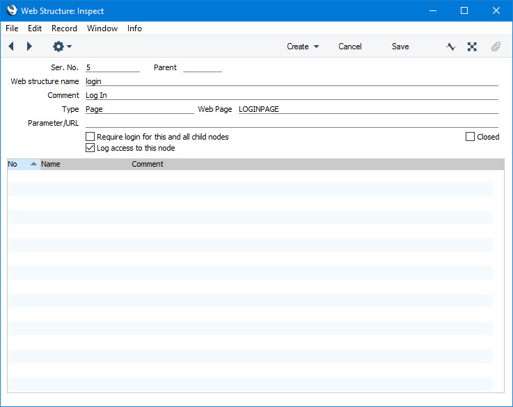
In this example we have already named the Page that we will go on to create in step 2.
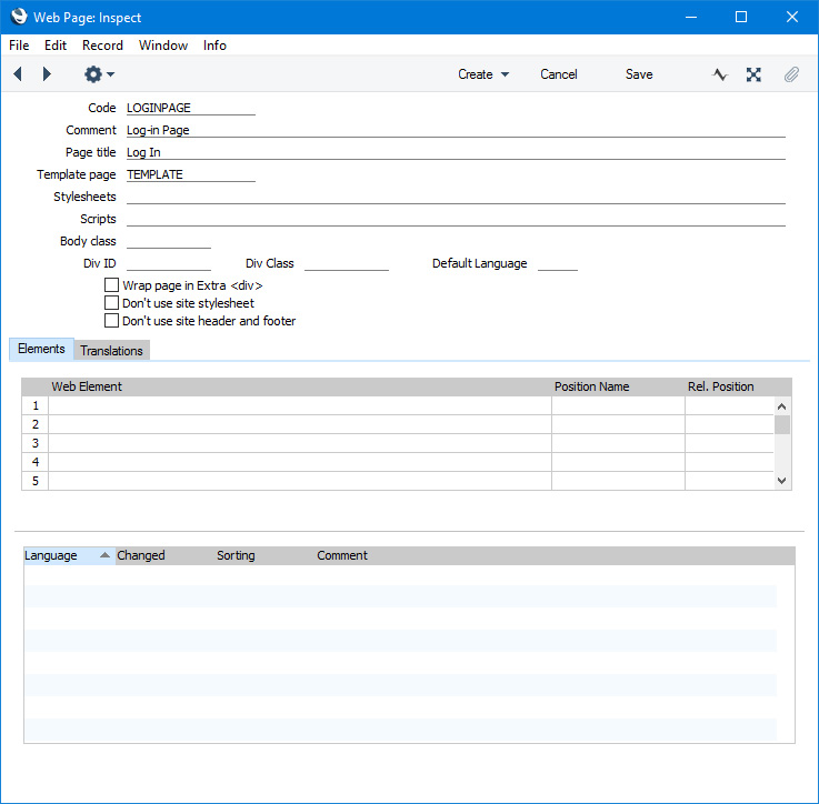
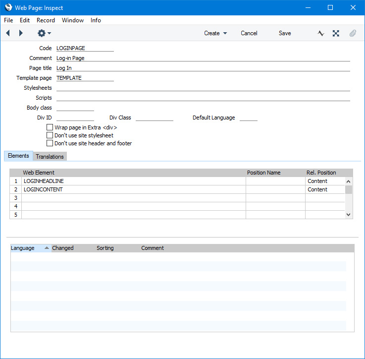
- Add a new record to the Page register that you will then use to list the Elements that will be displayed on the log-in page:
- Add an Element to display the ID and password fields and the [Log In] button. The Type in this Element should be "Login Control". This Type of Element will cause the two fields and the button to be displayed automatically in their own <div> with ID "loginbox":
- ELEMENT-BEGIN
- <div> (assign an ID and/or Class to this <div> in the Element record)
- <div id="loginbox">
- (log-in fields and button)
- </div>
- </div>
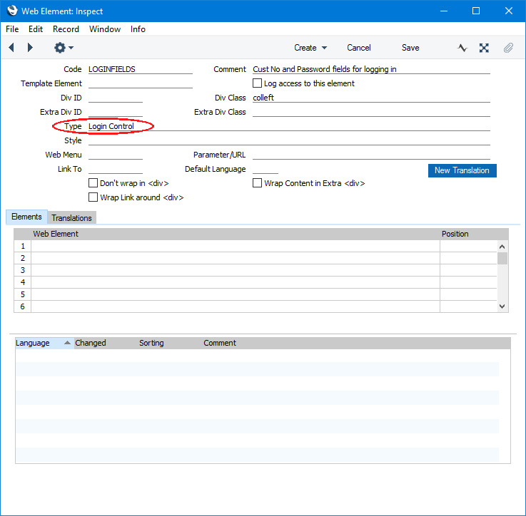
As the two fields and the button will be displayed automatically, there is no need to provide a Translation for this Element. If you need to change the default field and button labels (and/or enter translations), use the Web Texts setting as mentioned towards the end of this page.
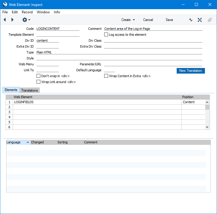
- For our example, we will enclose the "Login Control" Element in a container Element. This will allow us to enclose the main content area of the page in a <div> and to assign an ID to that <div>. This will be a standard Element in which the Type will be "Plain HTML":
- We will also add an Element with a connected Translation to display the page headline:
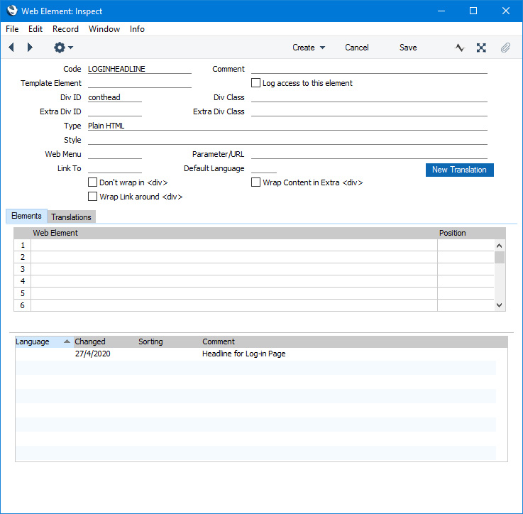
- List the headline Element and the container Element in the Page. The Rel. Position of these Elements should be "Content" so that the template Elements for the "Before" Rel. Position will appear on the page as well:
To add the button or menu item for browser users to use when they want to log in, follow these steps:
- Add an Element in which the Type is "Show Login State" and that you have linked (using the Link To field) to the Structure record from step 1 above. This Type of Element will display the text "Log In" or "Logout" (as appropriate) automatically and, because it is linked to a Structure record, it will also act as a button or menu item instead of being plain text:
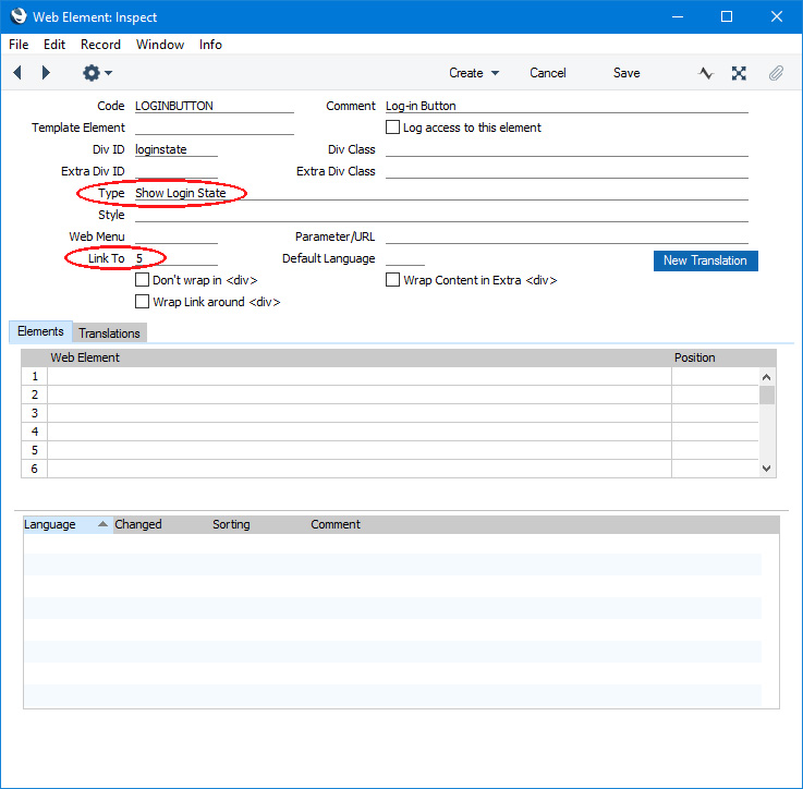
Again, there is no need to provide a Translation for this Element as it will display the text "Log In" or "Logout" (as appropriate) automatically. If you need to change these texts (and/or enter translations), use the Web Texts setting as mentioned towards the end of this page.
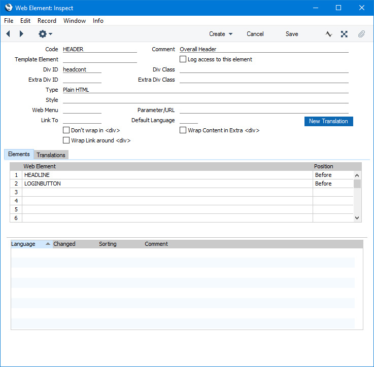
- Add the Element to the header Element or template Page (if you need it to be a button) or to a new Menu record (if you need it to be a menu item). In this example, we have added it to the header Element:
This is the result in a browser:
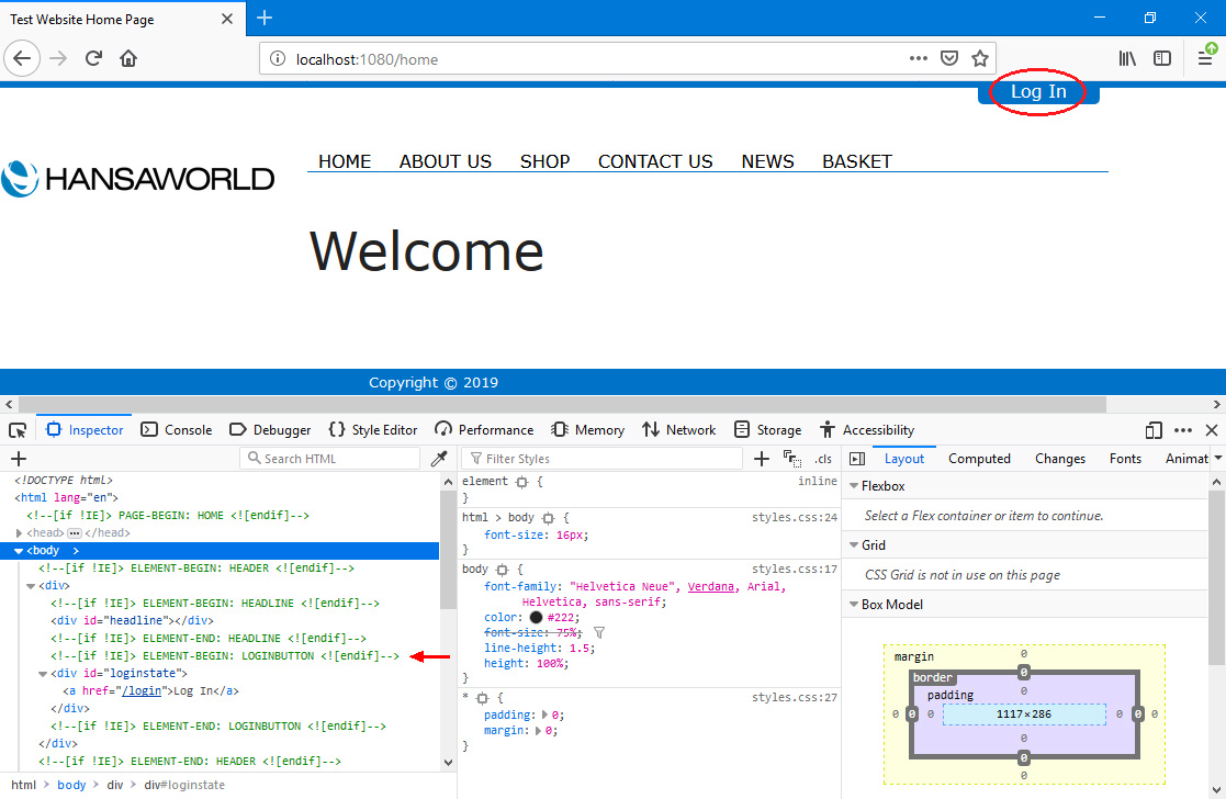
In this illustration, the following
<div> attributes are user-assigned (i.e. you can assign a different attributes or choose not to assign them at all):
- id="headline" (specified in the "HEADLINE" Element)
- id="loginstate" (specified in the "LOGINBUTTON" Element)
In this example, the browser user is not logged in, so the "Show Login State" Element (top right) displays "Log In" (
Web Text 20049). From steps a and b above, this Element is a button that will take the browser user to the log-in page (steps 1-6). The URL of the log-in page includes the Web structure name from the Structure record created in step 1 (/login), and this page displays the "Login Control" Element from step 3:
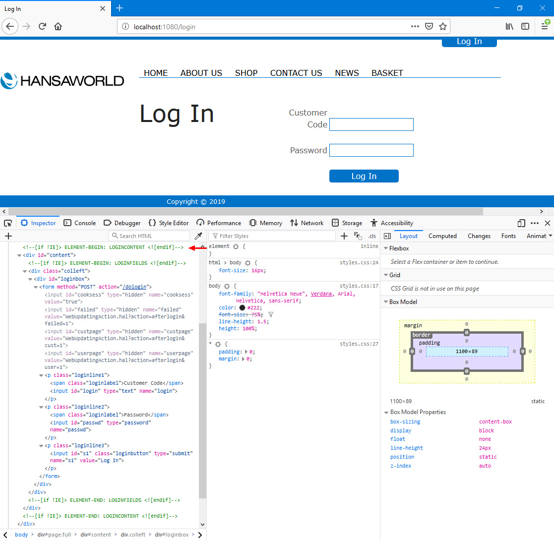
In this illustration, the following
<div> attributes are user-assigned (i.e. you can assign a different attributes or choose not to assign them at all):
- id="content" (specified in the "LOGINCONTENT" Element)
- class="colleft" (specified in the "LOGINFIELDS" Element)
The following attributes are assigned automatically by Standard ERP (i.e. you will not be able to change these attributes, but you will be able to apply styling to them in your .css file):
- <div id="loginbox"> (wraps the two log-in fields and the button)
- <p class="loginline1">, <input id="login"> (used for the Customer Code field)
- <p class="loginline2">, <input id="passwd"> (used for the Password field)
- <p class="loginline3">, <input id="s1" class="loginbutton"> (used for the [Log In] button)
- <div class="error"> (used for the "Login Failed" Web Text (Web Text 20081), not shown in the illustration)
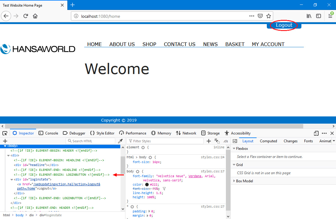
After logging in, the text of the "Show Login State" Element will change to "Logout" (Web Text 20026):
After logging in, the browser user will usually be taken back to the page where they were previously (but if you have selected the
Redirect to Account Page after login option in the My Account Settings setting they will be taken to the
My Account page (Structure/node whose Type is "My Account App")).
After logging out, the user will again be taken back to the page where they were previously. If they log out from the My Account page, they will be taken back to the log-in page (Login Page in the Sites setting). If they log out from a page that requires a log-in, they will be taken to the home page (Start Node in the Sites setting).
Selected Contacts and all Persons will be able to log in. Contacts will be able to log in using their Contact Code or their Email Address as ID, while Persons will be able to log in using their Signature, StandardID or Email Address. Please refer here for details about allowing Contacts to log in.
If you would like to display the name of the Contact or the Person who has logged in, add an Element in which the Type is "Logged in Customer/Person Name" to your header Element or template Page.
If a logged-in user is idle, they will be logged out automatically. By default, this will occur after the user has been idle for about eight minutes. If you would like to change the duration of the idle period, use the Timeout (minutes) field on the 'Web' card in the Program Mode register in the Technics module:
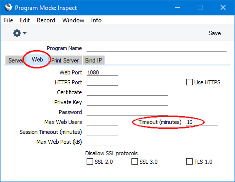
You will need to restart the server for the change to take effect.
You can use the Web Texts setting to change the following texts:
| Element Type | Default Text | Web Text Code |
| | |
| Login Control | Customer Code (field label) | 20154 |
| Login Control | Password (field label) | 20052 |
| Login Control | Log In (button) | 20049 |
| Login Control | Login Failed | 20081 |
| Login Control | Select which company you are a customer of [please refer here for details] | 25902 |
| Show Login State | Log In | 20049 |
| Show Login State | Logout | 20026 |
---
Allowing Contacts to Use Your Website:
Go back to: