Adding Cards to a Record Window
You may have too many fields to be displayed at once. In this situation, you can add cards to the record window.
In a record window with cards, the usual practice is for the most important fields to be permanently visible in the top of the window, while the lower fields will change, depending on which card you are looking at. In the example, there are five fields, check boxes and radio button sets: SerNo, TransDate, Location, OKFlag and Status. There is also the matrix. SerNo, TransDate, Location, OKFlag will always be visible, and so are said to be on card 0 (usually the term "header" has been used when referring to card 0 in these web pages). The matrix will be visible when the window opens: this is said to be on card 1. This will be replaced by the Status group of radio buttons when the user clicks the appropriate tab.
Follow these steps:
- First, insert a row in the Window Definition and set the Type to "tile". This should usually be the first row in the Window Definition. The purpose of this row is to specify that the window contains a card 0 (i.e. that it contains a header). All other columns in the "flip" row can be left blank or zero except the Height. Use this field to specify how deep the card 0 or header area should be. In other words, specify the distance in pixels from the top of the window to the blue bar containing the tabs:
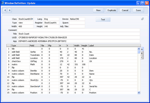
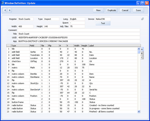
In the illustration above, we have added a "tile" row with Height 41, and we have also changed the H and V figures for the header objects, to make the header area a bit neater. Leave the 0 in the Tile column for these four objects, to signify that they are to appear on card 0 (i.e. they are to appear in the header).
- Next, insert a second "tile" row in the Window Definition. This will specify that the record window contains a card 1, so you should insert it above the rows containing the objects that will appear on card 1 (the matrix in the example). You can group all the "tile" rows together, or you can add a "tile" row, then its objects, then the next "tile" row, and so on.
Enter 1 in the Tile column, to specify that the "tile" row refers to card 1.
Use the Height column to specify the height of the card.
Use the Label column to specify the text that will appear in the tab (the button that the user will click to go to card 1). There is no need to specify the width of the tab button: this will be automatic, depending on the number of characters in the Label.
Finally in this step, set to 1 the Tiles of the matrix, the matrix columns, and the matrix flips. This specifies that all these objects are to be placed on card 1. You will also need to change the V figure for all these objects. Previously, when the window contained no cards, V was the measurement from the top of the record window to the top of each object. Now, it is the measurement from the top of the card to each object (i.e. from the top edge of the blue bar containing the tabs to each object):
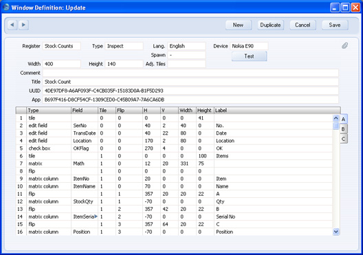
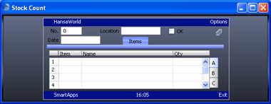
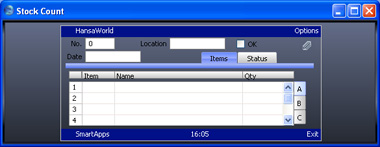
When setting the Heightfor card 0 (41 in the first "tile" row in the illustration above), remember to leave space for the tab (the button containing the word "Items" in the example illustration below). Note that the Height of the matrix (75) is slightly less than the Height of card 1 (100). This ensures everything fits neatly on the card. This is how the card will appear:
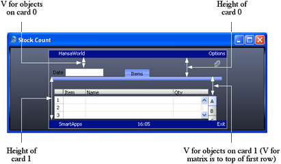
The following diagram illustrates how V and Height are used for objects on card 0 and card 1:
- Insert a third "tile" row in the Window Definition. This will specify that the record window contains a card 2, so you should insert it above the rows containing the objects that will appear on card 2 (the group of radio buttons in the example).
Enter 2 in the Tile column, to specify that the "tile" row refers to card 2.
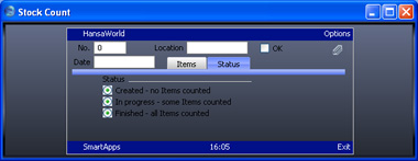
As in step 2, use the Height column to specify the height of the card, and use the Label column to specify the text that will appear in the tab. Make sure the Height is sufficient for the three radio buttons and the button frame.
Finally, set to 2 the Tiles of the radio buttons and the button frame, to specify that all these objects are to be placed on card 2, and make sure the V figures for these objects are correct (i.e. the measurements from the top of the card to each object). Remember the V measurement is from the top edge of the blue bar, so be sure to take the depth of the bar into account. In this case, you should also increase the V measurement to make room for the button frame name:

This is how the card will appear:
- The tabs (marked "Items" and "Status" in the example illustration above) are centred in the window by default. If a third card were to be added at this moment, the "Items" tab would be moved to the left and would encroach upon the Date field. To avoid this situation, you can use the Adj. Tiles field in the Window Definition header to move the tabs to one side. Enter a positive figure to move the tabs to the right, or a negative figure to move them to the left:
This is how the tabs will appear:
Please click the links below for more details about:
---
Go back to:
See also:
